The movie “13 Going on 30” may have warned you that redesign is a death sentence, but Facebook’s new app, Paper, is proving otherwise. A day before its 10th birthday, on Monday, Feb. 3, Facebook launched its separate iPhone app in the United States. AJ Dellinger from Digital Trends called it “a complete re-imaging.” Facebook took a lot of its good features, recycled them, and gave them a new look.
![]() What’s Different?
What’s Different?
First, the look of the app is different. Dellinger also pointed out that Facebook’s familiar logo is no longer prominent. It’s not the app’s logo, and it’s not obviously displayed anywhere in the app. There is a section titled “Facebook,” but we’ll get into sections later. Dellinger speculated that Paper is distancing itself from the company. TIME Magazine’s Harry McCrackent noted that Paper doesn’t have the common blue theme or vertical scrolling and tapping used to traverse posts and pages. Instead, Facebook took the common symbols, such as notifications and messages, and recycled them into a simple theme. McCrackent referred to the feel as “2014 aesthetics.”
The second change is navigation. I think Facebook is taking a more visual route, making this new app fit with full screen images. To navigate the different sections or posts, you scroll horizontally. One review described the movements as “natural,” although it took me a while to adjust. Traversing the app is largely based on this horizontal scrolling and swiping up and down, as if you are dragging things forward and pushing them back. If you haven’t seen the video at the top of this post, it’s easier to visualize what I’m talking about after seeing it. I think the app looks mature, especially with what Dellinger called, “seamless transitions.” In addition, when you’re opening an article, it transitions like you’re opening up a physical newspaper, although Dellinger described it as opening a card.
Third, Facebook added at least three new features, although I’m still exploring and discovering. Elyse Betters noted that Facebook went the route of news aggregator with its addition of sections. Sections are what Betters called a “classic way of retrieving news but with a fresh twist.” McCrackent explained that each section pulls information and stories from established companies and experts in that specified field. Currently, Paper offers 20 sections, including the already selected “Facebook” section with your own news feed from friends and  pages you’ve followed. Roberto Baldwin of Wired revealed that Paper has a “Read Later” option that works with Pocket, Instapaper, Pinboard and Safari Reading List. I didn’t know about this feature until I read his article. Last, when posting a status in Paper, there is special drop down menu where you can select who does and doesn’t see the post.
What’s Lacking?
McCrackent observed that Paper doesn’t have all the features the old Facebook app offered, such as events, apps or lists. I’ve also noticed it doesn’t have a difference between pages or groups. It’s simply a long list of all the pages and groups you’re associated with. For those not regularly using these features, Paper is perfect. However, I regularly use most of them, and am therefore keeping the old Facebook app as well. At least until Paper adds in those features.
One issue I’ve dealt with is the swiping down motion. My iPhone 5 often mistakes this for the phone’s drop down menu, which can get frustrating. I have to ensure I’m not touching the very top of the screen when swiping down perform the operation inside the app.
Regardless of the social media platform, people (myself included) want customizable settings and personalization. In Paper, you can 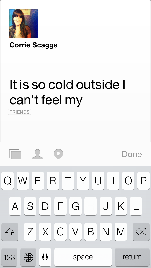 select which of the additional 19 sections you want. However, you cannot specify what companies, people or news organizations from which to get information. Rather, Facebook already chose your sources from established, well-known companies or experts. I think people will want more selection.
General Consensus
Most of the reviews and articles on Paper were positive, although many, myself included, had some areas in which Paper could improve. McCrackent said this was the future of Facebook, seeing is as a success compared to the recent failures of Messenger or Poke (Facebook’s Snapchat knockoff). Dellinger described this app as Facebook’s efforts to save itself from the impending death so many forecast, such as Dan Tynan’s post, “Is Facebook Dying?”
I my opinion, Paper is a wonderful restart. I agree with McCrackent when he suggested it was a way to avoid shocking people with change or forcing them into a new design. I agree this is the future of Facebook. I think the company is paying attention to the general desire for news via social media and the high importance placed on visuals. I think Paper can be an excellent tool for Public Relations professionals who’ve gotten tired of the old layout. I would suggest all PR people download the free app and get familiar.
Stuart Miles pointed out that the company is currently facing issues with the name, receiving an open letter from FiftyThree (the company behind the iPad drawing app, Paper). Overall, I do see Facebook listening to feedback. After an interview, Jake Smith reported that Facebook wouldn’t be making any changes until it’s gotten feedback from users. I, for one, love the recycled features and new look. I’m excited to see what’s in store.
